In the last post, I mentioned that there are two letters s in ancient Egyptian. You won’t have been impressed. Who is going to be impressed by two s-es when they already know about the four h-es (even though they haven’t met them all yet)?
Actually, the s situation is a bit more complicated than I let on. There are two s-es rendered in transliteration, but one of them has two hieroglyphs to go with it. We had one in the last post: ![]()
That was the vertical one. Now meet the horizontal one:![]()
Originally, it was pronounced more like a z, but it evolved into an alternative way of writing s, depending on whether or not the scribe had to fill a vertical or horizontal space in a group of signs. You can see the point immediately in the full version of our tomb owner Senusret’s name:
We’ve already met the goddess Usret, “the powerful (female) one”, whose name appears first in writing, even though it comes second in pronunciation. Now we’re on the second part of the name in writing, although it was the first part of his name when spoken:

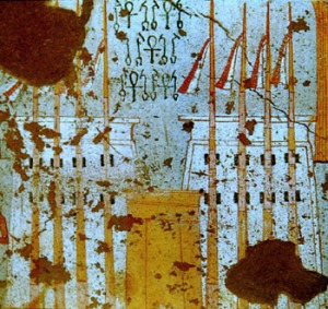
 se-en; “man of”. The horizontal s hieroglyph depicts a bolt, of the type you can see on the doors of the golden shrines of Tutankhamun:
Here’s the carved relief version from the cartouche of King Sesostris in the last post:
It’s simple to draw: a straight line with a couple of short cross-hatches in the middle will do. And there we have it: se = man.
The n holds no mystery for you. We’ve seen it all before. It’s a ripple of water. It means “of”. You know that. So, on to the final sign in this group:
Isn’t he lovely? He’s a seated man, and he has no sound – he’s the strong, silent type. He has no sound because he is a determinative – a hieroglyph stuck on the end of a word to show what kind of word it is. We’ve had a determinative before, remember? The town or city determinatives in the first line of the offering formula are the same kind of sign. I explained then that, because the Egyptians wrote very few vowels, they had to use some device to distinguish between words which sounded different when spoken, but had the same sequence of consonants when written down. This is what the determinative does – it shows it’s the word for man, as opposed to a similar word meaning something else. But you remember all that.
In this case, though, he’s not part of se, man, but of the name as a whole: he’s the male determinative for the masculine name, Senusret.
He’s complicated to draw, but he’s worth it for the animation he will add to your enigmatic line of Christmas card hieroglyphs. Inanimate symbols are attractive enough, but you can’t beat a cute little animal or a tiny little person for instant appeal. I usually start with a circle for the head, then a triangle, pointed side down, for the torso. A second triangle, pointing left (in this case) forms the lower leg, and a smaller one sticking up behind it forms the raised knee. You can put in two short strokes for the feet, and two bent lines for his arms, as though he’s doing an impression of Toulouse-Lautrec power walking. And you’ve created a little man.
Here’s one they made earlier, when they were painting texts on a coffin:
See? He doesn’t have to be that complicated. They’re simple creatures, after all.


