Susanllewellyn's Blog

August 28, 2009

Office hieroglyphs (19)

I bet you’re starting to get annoyed now, aren’t you?  You’ve been sitting there at the offering table for days.  The waiter brought your bread and beer and then cleared off.  That was days ago.  Not a sniff of dinner since.  There aren’t even any crumbs left – and that’s saying something for an ancient Egyptian funerary feast.  You know how much they loved their bread.  You’re must be almost on the point of walking out.

If you think you’ve got it bad, imagine what it must have been like for the ancient Egyptian (deceased); (what it may still be like, for all we know, if you’ve read Terry Pratchett’s Pyramids).  Eternity could go by, and still no main course – to prevent which is the point of the offering formula, of course.

I am terribly sorry.  You must be starving.  Let’s bring on the meat.

kau apedu shes menkhet hieroglyphs  kau apedu, shes menkhet transliteration


Kau apedu, shes menkhet:  meat and fowl, alabaster and clothing.  Not just the main course, but the fingerbowl and napkin afterwards.  How’s that for service?

Let’s take the first pair of dishes:  kau apedu, meat (and) fowl.  (You’ll have noticed by now that the ancient Egyptians didn’t bother much with the word “and”.  In that respect, they were five millennia ahead of Google.) 

Ka is the word for ox or beef, and is written with the head of an ox.  Aped is the word for bird, and is written here with the head of a pintail duck.  In the compressed rendition of the offering formula, they stand for any kind of meat or fowl; a limited menu is no good when you have the whole of your afterlife to fill.  The –w suffix, conventionally pronounced –u, is the plural, and is normally rendered by three short strokes, which are absent in this handwritten version but present in the painted version, below:

kau apedu shes menkhet painting077

The ox head is a tricky sign to draw, but satisfying when you master it.  You can start with a roughly trapezoid outline for the shape of the head, rounding the corners and going in a bit for the bridge of the nose.  Then add a u-shape on top for the horns, a little ear and a dot for the eye. 

For the duck’s head, I usually start with the beak, widen out the head and give it a graceful curved neck.  It may not be a swan, but it’s not an ugly duckling, either.  And don’t forget to dot its eye as well.

Meat especially was a high status food, usually served only to the gods and their servants, and to the wealthy.  The well endowed tomb owner expected nothing less, and expected it served on the best dinner service, too, hence the stipulation of alabaster. 

The loopy-looking sign pronounced shes  is indeed a loop: a loop of cord or rope, pronounced in a similar way to the word for alabaster and so used to express it in writing.  But they didn’t want any ropey old dishes.  They were expecting something more like this:
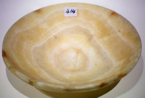
alabaster dish alabaster jug


I don’t need to describe how to draw the loop of cord, do I?  Let’s move on to the final sign, menkhet:  clothing.

We’ve all seen some outlandish catwalk creations, some of them being worn in restaurants, but even so I doubt that many people would identify the menkhet sign as an item of clothing.  It looks more like a child’s swing.  But, you know how things look completely different when you see them through a microscope?  Well, the menkhet sign is an extreme close-up of the edge of a piece of cloth.  It’s the edge of a piece of cloth with a fringe, in which the individual threads are twisted together to make thicker dangly bits.  The symbol shows two sets of two threads twisted together.  You’d think they’d be hanging down, wouldn’t you, but they’re sticking up.  They went in for subverting expectations in ancient Egyptian couture. 

You can see an example of fringing in this tunic:

fringed tunic

At least the hieroglyph is easy to draw:  a straight line with two upside-down y shapes on top. 

And this completes the second line of the offering formula.  (Not so fast, you’re saying, what’s that extra sign under the three short strokes in the painted version?  It’s a rolled-up garment of some sort, reinforcing the clothing idea of  menkhet, but stuck under the food signs for the usual reason of pleasing arrangement of the signs.)

As I was saying, this completes the first two lines of the offering formula.  To recap:

first two lines

Well done!  That was worth waiting for, wasn’t it?  But I won’t blame you if you don’t leave a tip.

July 30, 2009

Office hieroglyphs (6)

Hang on, you’re probably saying; you mean the ancient Egyptians – the same Egyptians who built pyramids and temples, quarried tombs in the Valley of the Kings and filled them with treasure, organised the massive machine of state and sent armies marching and conquering all over the Near East, those Egyptians – thought the best possible way they could represent in writing the King they believed was a god on earth, was:  a blade of grass and a loaf of bread? Are you sure we’re talking about the same Egyptians? And anyway, the Mesopotamians invented writing first.

 Well, I could conduct a forensic investigation into the etymology of the Egyptian word for King, but I think you’d doze off long before the end.  You’d wake up to a dark office (especially if you’ve got motion sensors on your lights), the baleful glare of the screen saver and the symphony of banging sounds that denotes the arrival of the cleaners.  So I’ll try to make it a bit more interesting by bringing out the narrative.

 Once upon a time, in a land far, far away (unless you’re reading this in Egypt, in which case it’s pretty close), some forty-odd independent tribes occupied the valley and the delta of the river Nile.  We’re talking about a time way before the invention of writing.  For at least one of the valley tribes, the sedge plant assumed great significance.  It’s a useful plant (papyrus is a member of the sedge family, and you can make lots of things with it besides writing materials) and it also has a symbolic significance, as the green shoots sprouting through the mud in the ancient springtime came to represent the rebirth and regeneration part of the cycle of life and death.

 For these and who knows what other reasons, the sedge plant became a heraldic emblem among the tribes in the Nile valley. All the tribal leaders had different emblems, although some of them were out of the same design stable.  Anyway, as tribes will, they went to war.  Over many years, through a process of conquest and assimilation, two leaders managed to unite the Nile Valley and the Nile Delta tribal lands respectively into two kingdoms:  Upper Egypt or the Nile Valley, and Lower Egypt, or the Nile Delta.

 The King who united Upper Egypt used the sedge plant as his emblem and was strongly identified with it; so much so, that he was known as “He of the Sedge”.  The Egyptian word for sedge is swt (pronounced sut to rhyme with loot) and “He of the Sedge” is ny swt. 

 The inevitable battle for supremacy over the whole of Egypt took place somewhere around 3000 BC, and of the rival Kings, He of the Sedge won.  So the title which had once meant only “King of Upper Egypt”, although it continued to be used as such, also came to be used simply as one of the words for King.  Over time, the letter t became silent and the word evolved into nsw / nesu

 Remember when I said a few posts back that the principle of Egyptian writing was to use pictures to represent sounds?  When they wanted to write the sound sw / su, they drew a little picture of the sedge plant, because that was how its name sounded:


  They had another symbol they used to write the letter t : the word for bread was t / te, so they used the loaf sign to represent the t which once existed in the word swt but fell out of use:

 Stop there a minute, you’re probably saying; I’m looking at the word for King.:

 nsw

 Nsw, right?  So what happened to the nyNy obviousy means “He of”. Where is it?  We’ve got a sw all present and correct, a t that’s superfluous to requirements and a completely missing ny.  

Well spotted.  This is a very abbreviated spelling of the word nesu, pared down to its basic heraldic element, the sedge sign.  This is the kind of thing that happens with formulae.  You want to write them quickly because you have to write them so frequently, so you strip them down.  You’ll appreciate that when you’re scribbling on that card, especially if your office has clustered birthdays / lots of women of childbearing age / a high turnover of staff / all of the above.

 However, paring it down to one tall, thin letter would leave an unpleasing gap above the short, wide sign which comes next, so they filled it with the superfluous t.  Whatever you may think of their flexible approach to writing, they allowed nothing to compromise their artistic integrity. 

 If you look at the longer spellings of nsw, you’ll see the missing n:  it’s the wiggly line:


  We’ll come to the letter n later in the formula.  Don’t worry, it’s there.  In fact, it’s got a whole word to itself.

Oh, and about the Mesopotamians – shh, don’t tell the nsw.  You never know what a powerful sign like that might do.

Blog at WordPress.com.